
Game of Tones – it’s time to be brave with colour
For years the crown of interior colours has been worn by shades of beige. From Half Tea to Nougat to Biscotti, colours with names like afternoon snacks have reigned supreme. But is it time to say bye to beige?
Colour plays a role in every aspect of life; it can determine the appeal of a meal, the joy of an occasion, or the professionalism of a document.
Beige paint schemes are a neutral workhorse. As far as colours go it is inoffensive and non-confrontational. It is known to provide a blank canvas on which to make your art pop, but one could argue it is also a little dull, and certainly, a lot dated.
Beige asks for nothing, and in return it delivers nothing. It is a banal relationship of non-committal. Surely your next commercial refit deserves more?
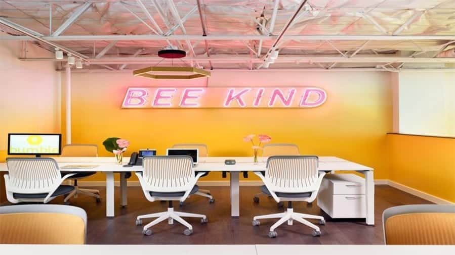
Maybe it’s time to be brave with colour. Put a stake in the ground and stand up for something.
Plumbing World did, and the consumer response has been hugely positive. A significant increase in foot traffic to the showroom is part of the landscape for increased sales, all directly attributed to the impactful effect of Outline’s new showroom design. A key feature of the fit-out is the ‘colour emersion’ pods. Scaled to recreate a domestic bathroom, the pods showcase product to best effect, the monochromatic treatment of each setting various moods and styles, allowing the product to be the hero in each space.
There will always be a place for beige, but for a dynamic business like Plumbing World taking the leap into colour has been a bold step that communicates their company culture, their openness to opportunity, to staying fresh, agile and contemporary.
About Outline Design
Outline Design is an established commercial interior design firm based in Auckland, New Zealand offering the full range of interior design services. To find out more contact us.


