
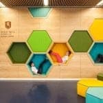
Colour My World . . . Office Colours and Designs
When we design a new workspace, move premises, or revamp the one we’re in, colour choice is definitely a key player. Many colour experts argue that colour can have a huge impact on businesses productivity, employees’ behaviour and emotions, perception of your brand and company vision. So, what to make of all these claims, and how much of the ‘colour-tivity’ concept should we apply to workspace design?
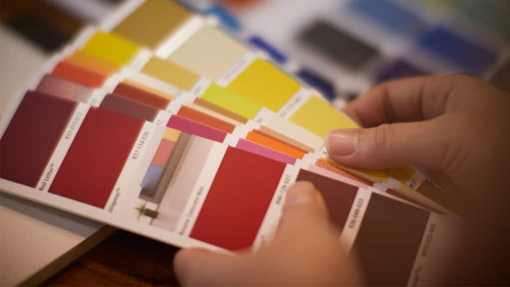
Colour intensity . . . A shading influence
Colour psychology is not a new measure of thinking. Its origins date back to the early 19th Century when Johann Wolfgang von Goethe first published his book ‘Theory of Colours’. In more recent years, renowned colour psychologist, Angela Wright, carried out scientific research around the use of colour and business mentality. Wright revealed that wavelengths of colour, converted to electrical impulses, passed to the brain, govern our endocrine system and hormones – thus, influencing our actions.
However, focus should not just be on ‘a colour’ when planning a workspace, says Wright, rather the intensity of a colour. Nina Cryer, of Outline Design agrees.
“Colours do have general connotations attached to them, for example blue being a calming colour. However, it’s more apt to consider the various shades within a specific colour palette – like pastels and blue-greys when planning a space,” says Nina. “We (Outline Design) don’t have a list of specific colours that we would steer people towards or away from, rather we design on an individual case-by-case and space-by-space basis.”

Colour plus . . . Uniting different notes
Colour is after all a very personal choice – not just scientific. Only you will know the colours that make you feel the most productive and those that fit your company code.
“Colour selection is very subjective to the individual person and style of business. Colour is important to consider with each company as their space represents them – you wouldn’t put a Ferrari Red in a BMW office,” explains Nina.
And colour never works in isolation. As American jazzman Thelonious Monk once said, “Colour works exactly the same way as music, there are no wrong notes.” It’s the way in which you use colour alongside other colours, furnishings, light sources, planting, that evokes certain emotions and creates an appeal.

“Considering the paint finish is equally as important as considering the colour for a wall or feature wall in workspace,” says Nina. “Matt, high sheen, low sheen, high gloss, these can completely transform the intensity of a colour. Certain paint finishes and use of light – be it natural or artificial – can also enhance texture and materials, or disguise or highlight a surface.”
Different strokes . . . Finding your office paint colour schemes
There isn’t a one-size-fits-all approach to choosing office colours and designs for your work space. As we know, people view colours differently and age, gender and cultural factors all influence our perceptions of colour – and may affect our performance within a space.
Going with your gut is key, says Angela Wright, “but only after determining which part of you that you’d like to affect.”
So, whilst your physical space dynamics, brand vision, and company’s make-up will ultimately dictate which colour you splash on the walls – or floors and ceilings – it’s interesting to note a few of the key connotations behind some of our primary shades. Colour for thought!

Blue – Promotes a soothing, calm and fresh environment. Good for high traffic areas in an office space, for example kitchens, bathrooms.
White – Cleanliness and purity. An ideal colour to define with, making smaller areas appear larger and a crisp white can instantly freshen up a space.
Green – Regarded as a symbolic colour of good luck and abundance, nature and friendliness. An apt choice for a foyer or entryway because it eases the transition from outside to indoors.
Red – Power and passion at its fore. Good as an accent colour and to warm up a space with.
Black – Packs a power punch and connotes wisdom – adding depth to a room. Ideal to use in small amounts with contrasting, complementary colours and statement/focal point.
Yellow – A colour associated with creativity and happiness. It can work well in combination with neutral colours and in large spaces with plenty of natural light to create a peaceful environment.
About Outline Design
Outline Design is an established commercial interior design firm based in Auckland, New Zealand offering the full range of interior design services. To find out more contact us.

